The Field Guide for Decision-Makers applies science thinking to the work of acting on climate evidence. It helps decision-makers check that numbers are interpreted clearly, uncertainty is understood accurately, and action is prioritised at the right scale, so that climate information remains useful as it moves from evidence to decision.
It is structured around two practical moments: before you send evidence, analysis or recommendations, and before you act on what you have received.
Before you send
Apply this before sharing climate data, analysis, or recommendations. The goal is not to add caveats; it is to make sure what you send can be understood and acted on correctly.
If you cannot answer a prompt, flag the gap before sending rather than leaving the recipient to discover it.
Numbers feel complete. They are not.
Uncertainty is not a weakness in the data. It is information.
The key points: where harm is greatest, what is within reach, and where impact and feasibility overlap.
Have I stated which activities, geographies, or time periods are included in this data, and where key gaps or emissions are missing?
Have I communicated a range of outcomes, not just a central figure, and noted how impact differs if risk arrives in concentrated, severe bursts?
Have I indicated which findings point toward high-impact actions and which harm is greatest while being honest about what is within reach?
Have I stated how this figure was calculated and what its error margin is? Am I presenting it with more precision than the method supports?
Have I explained what terms like “likely” or “moderate confidence” mean in numerical terms, not just in everyday language?
Have I identified co-benefits, cost savings, resilience, health or social benefits that make the case for action more durable?
If I am presenting a reduction or improvement claim, what is it compared to: last year, same scope, same methodology? Are absolute emissions moving in the right direction, not just relative ones?
Have I checked whether this is a global or local figure, relative or absolute, and clarified its relevance to my audience’s context?
Have I distinguished how this action unfolds over time and shown that the transition matches the urgency of the problem?
Have I combined figures with logic or contextual knowledge and noted where the two tell different stories?
Have I checked whether this assessment accounts for who is affected, how resilient they are, and their capacity to respond, not just the probability of the hazard itself?
Have I considered whether this action shifts harm elsewhere or makes it harder to change course later?
Have I presented scenarios that include severe but plausible outcomes alongside the most likely one?
Have I been transparent about whose activities are outside the scope of this data, and who benefits from that exclusion?
Have I identified who is most exposed to this risk, and whether the burden falls on those least able to carry it?
Have I been clear about who has the power to act on this, and who bears the cost if they do not?
Before you act
Apply this when receiving climate data, risk assessments, or recommendations. These are not questions to challenge the evidence; they are questions to understand it well enough to act on it correctly.
If you cannot get a satisfactory answer to a prompt, treat that as a gap in the information you have been given, and factor it into how much weight you place on the findings.
Before acting on a figure, understand clearly what the finding does and does not cover.
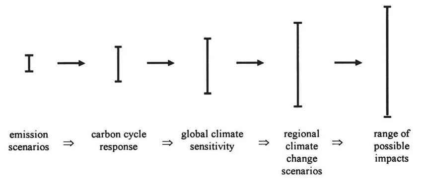
Uncertainty does not mean the finding is unreliable. Ask what the range of outcomes is and the probability of each.
Before deciding what to do, check that actions address the largest sources of harm and are proportionate.
What does this data cover, and are any significant impact areas absent or underrepresented?
Is this a single figure or a range, and does it account for different ways the risk may arrive (gradually or in concentrated bursts)?
Which actions address the largest sources of harm, and where do impact and feasibility overlap as a starting point?
How was this figure calculated, and what is its error margin? Does the precision claimed reflect the method used?
When this data uses terms like “likely” or “high confidence,” what do those terms mean in numerical terms, not their everyday meanings?
Are there co-benefits, unintended consequences, or opportunities in the system (cost savings, resilience, health or operational gains) that strengthen the case for acting now?
If this is a reduction or improvement claim, what is it compared against: same scope, same methodology, and are absolute emissions moving in the right direction?
Does this assessment account for who is affected, how resilient they are, and what capacity exists to respond, or does it focus only on the probability of the hazard?
Do the proposed actions build on each other over time, and does the timeline match the urgency of the problem?
What local or contextual knowledge would I need to interpret this responsibly, and do I have it?
Are these projections based on global averages or on conditions relevant to my setting: geography, sector, and context?
Does this action reduce harm overall, or does it shift elsewhere or make it harder to change course later?
What is the most severe plausible outcome alongside the most likely one, and is the proposed response adequate for both?
Whose activities fall outside this scope, and who benefits from that exclusion?
Who is most exposed to this risk, and do they have power and resources to respond? Is the burden fair on those least able to carry it?
Who has the power to implement this, and who bears the cost if action is delayed?